01
Logo & mark
Wordmark for most uses; the bee flies alone when space is tight. The dotted line may run off any edge — the journey continues past the artifact.
Final bee illustration comes with the logo session — this geometric stand-in defines posture (in flight, slightly tilted, glowing) not final linework.
02
Color
Dusk does the mood; honey does the pointing. If everything glows, nothing does — honey stays under ten percent of any layout.
#EDE6D6
ground · 55%
#1F332A
depth · 25%
#FBF7EC
cards · 10%
#FFAD1F
the find · 7%
#1E1B15
ink · 3%
03
Typography
Poppins carries the personality — bold only, never light. Inter does the reading. Nothing else.
Poppins Bold — display
The best little spot in town.
Poppins SemiBold — hooks & labels
What really stings?
Inter Regular — body
You opened because you're great at the thing you do. Marketing was supposed to be the easy part — that's where I come in, and I bring the coffee.
04
Voice
Warm neighbor first, sharp copywriter second. Every page earns exactly one stinger — a line with edge — and the rest stays generous.
Sounds like us
- “I'll take a lap around your marketing and tell you the truth over coffee. Free.”
- “Great isn't enough if nobody knows you exist. That's not your job. It's mine.”
- “Locals only. Tell no one. (Fine, tell everyone.)”
Never us
- “We leverage omnichannel synergies” — jargon is a locked door.
- “Your business is failing and you don't even know it” — fear-selling. The ache is named with love, never weaponized.
- Three puns in one breath — one strong pun per section, or none.
05
Graphic devices
Three devices, used sparingly: the flight path (dotted honey line, always going somewhere), the hexagon (photo crops and bullets only), and the honey highlight (one phrase per page gets found).
The flight path
Connects, never decorates. Ends at a destination — a CTA, a signature, an edge.
The hex
Structure, not wallpaper. Photo crops and bullet marks — never a honeycomb background.
the places locals rave about
The honey highlight
The “found it” light. One phrase per page. It marks what matters most.
06
Imagery
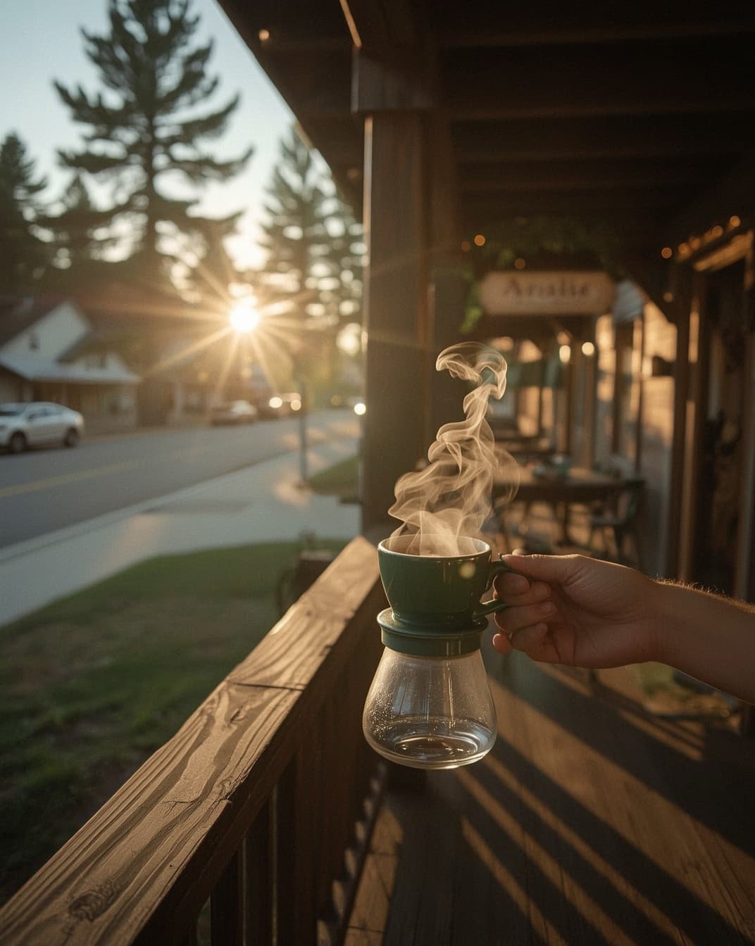
Dusk and first light — the two hours when Flagstaff glows. Real places, warm grade, one point of light in every frame. Same photo below, graded to spec.
07
In the wild
The cotton business card — front and back. The dotted line runs off the edge; the back line is designed to make someone ask about it.
Brandon Hall · Flagstaff, AZ
Front — cotton stock, spruce ink, honey line off the edge
Bees don't keep secrets.
928-563-5141
Back — the line that makes them ask. The answer is the pitch.
08
Hard rules
- Never imply the big-brand training work was client work.
- No honeycomb wallpaper, no cartoon bee with a face.
- Honey never exceeds ~10% of a layout — glow needs dark.
- One pun per section. Corny kills credibility.
- No stock photos of generic 'small business owners' — real Flagstaff or nothing.
- The fear is named once, with empathy — never repeated as pressure.