The blend, on purpose
The bee and the mountain pull in different directions unless you give each a lane. Here's the lane assignment.
The bee is the person.
B is Brandon's actual nickname — the name his people gave him. So bee things stay small and personal: the mark, the flight path, the card in your hand, the signature on the Scout Report. The bee never becomes scenery.
The mountain is the place.
Flagstaff things stay big and environmental: horizons, textures, light, the red rock behind the trees. The landscape never tells a joke, and it never shrinks to an icon.
The hinge that makes them one brand: honey and red rock are the same warm family. Gold light on sandstone at dusk isthe palette — the bee's color was in the landscape all along.
Logo & mark
The wordmark gets a hand-pulled underline — one stroke, red rock. The monogram is just B: two stripes make it a bee, no wings, no cartoon. It's a nickname, set in type.
the pinecone — line-drawn, never rendered
The badge lockup. For the moments a full crest earns its keep: the sidewalk sign, a stamp, a sticker on a to-go cup, the back of a hoodie. Ours, not stock: the ridge is the Peaks' profile, the trees stand like a real mixed stand, and B flies the loop overhead — no licensed badge can say any of that.
Color
One addition changes everything: Red Rock. Its rule comes straight from the landscape — it peeks through, it never walls. If red rock covers more of a layout than the pines do, we've left Flagstaff.
#F2EADA
ground · 52%
#24382C
depth · 26%
#FAF4E6
cards · 10%
#F5A623
the find · 7%
#B4552D
peeks through · 5%
Intentional roughness
Homegrown, not sloppy. The reading stays crisp; the roughness lives in the details around it — grain, hand-pulled lines, corners that were cut by a person. Four sanctioned moves:
1 · Paper grain
A whisper of film grain on surfaces — this card has it, the page background doesn't. Felt more than seen. Never on body text blocks.
2 · The hand-cut corner
Every corner radius on this page is slightly uneven — cut by hand, not by machine. Uniform rounding is the single fastest tell of template-ware.
3 · The hand-pulled line
Underlines and dividers wobble like a brush stroke — one per moment that matters, replacing the honey highlighter in this dialect.
4 · The stamp
Labels sit in a dashed, slightly rotated frame — like a rubber stamp that landed almost straight:
Scout approvedGraphic devices
The flight path now crosses country: it rides above the ridgeline, dips behind the trees, lands on what matters. The ridgeline itself becomes the section divider. The pinecone marks small things the way the hex used to.
The flight over the ridge — the dance, drawn across the country it serves.
Pinecone bulletsfor lists & markers.
Honeycomb stays off the screen. It lives in the hand instead — debossed into the cotton card below, where a pattern becomes a texture you feel. The one place it earns its cliché is the one place you can touch it.
Imagery
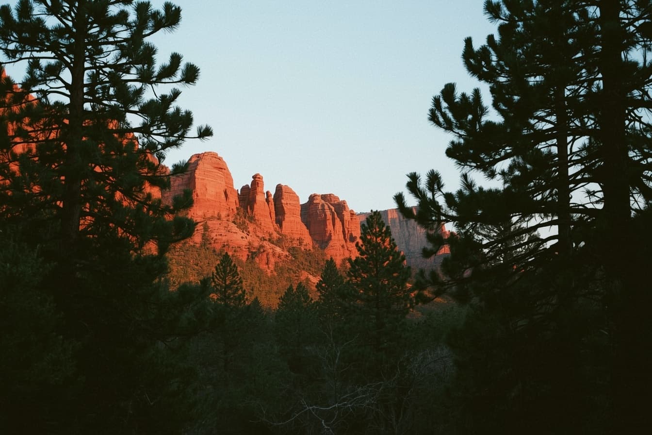
The scene Joel named: red rock peeking through the trees. Warm stone behind dark pine — the brand palette, photographed. Real Flagstaff photos from Brandon replace generated placeholders as they come.
The cotton card — deboss options
Cotton stock takes a deboss beautifully: ink stays minimal, the design is pressed, not printed. Two candidates — the flight path (the story, pressed into paper) or the honeycomb (the motif we kept off the site, saved for the hand).
Brandon “B” Hall · Flagstaff, AZ
Option A — the flight path, debossed, running off the edge
Brandon “B” Hall · Flagstaff, AZ
Option B — honeycomb cluster, debossed, bleeding off the right edge
Back of card, either way: “Bees don't keep secrets.” letterpressed in pine ink, phone number underneath. My lean: Option A — the path is ours alone, and it hands B the story when someone runs a thumb across it and asks.
Voice — and the story under the name
The biggest asset this direction gets isn't visual. Busy B isn't a pun we reverse-engineered — it's what people actually call him.
Sounds like us
- “Somebody once told me I'm a busy bee. It stuck — my people just call me B now. The name was theirs; the work is mine.”
- “Made in Flagstaff, for Flagstaff: pine pitch, red rock, and one good idea per season.”
- “I'll take the lap on foot. That's not a metaphor — bring a coffee for the cold days.”
Never us
- Performative rustic — no “howdy,” no lassos, no woodgrain wallpaper. Homegrown is a texture, not a costume.
- Faux distress — fake coffee stains and grunge overlays are lying about age. Our roughness is made by hand, not by filter.
- Turning B into a mascot — the nickname is a person's. It gets a story, never a cartoon.
Homegrown, not amateur
Three working principles (sharpened in review with a second creative) that keep the rough layer from ever reading as sloppy:
Illustration is structure.
Bee paths and ridgelines guide the eye between sections — they never float as decoration.
The bee stays smart.
No cartoon mascot. The bee is a scout, a signal, a navigator — and a nickname.
The grid does the polish.
The hand-drawn layer can be imperfect because the spacing, hierarchy, and CTA rhythm are not.
Hard rules
- Red rock peeks through — never a full wall, never more coverage than pine.
- Roughness lives in details (corners, lines, grain); reading text stays crisp and level.
- Bee = small & personal. Landscape = big & environmental. Neither takes the other's job.
- Honeycomb is tactile only — deboss, letterpress, blind emboss. Never a screen pattern.
- One hand-pulled underline per moment that matters; two is a doodle.
- Generated imagery is placeholder — Brandon's own Flagstaff photos replace it as they come.