SilkCards cotton · 45pt · deboss · foil · colored edge
The card, eleven ways.
Two concept boards. Every card is layered cotton with blind deboss you can feel, a foil accent, and a painted edge. Click either board to open it full-size — then tell us which fronts, backs, and details deserve to survive.
Board one — seven concepts
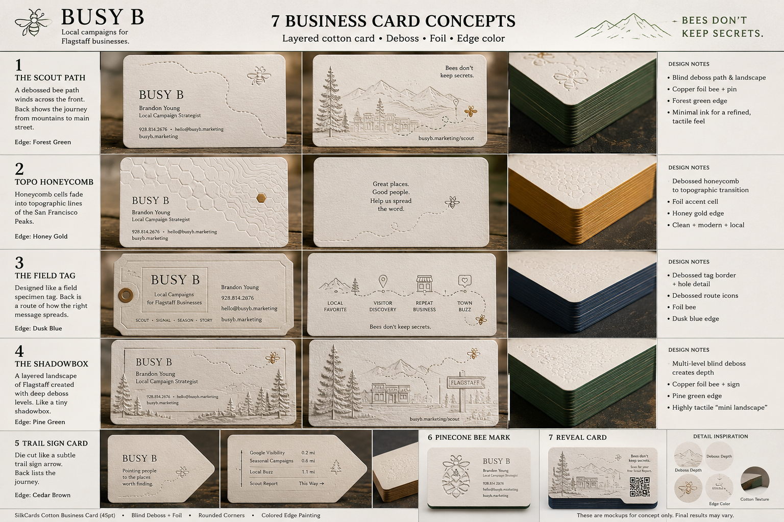
Click to open full-size and zoom.
- 1
The Scout Path Forest green edge
Debossed bee path winds across the front; back shows the journey from mountains to main street.
- 2
Topo Honeycomb Honey gold edge
Honeycomb cells fade into topographic lines of the Peaks — the hive becoming the mountain.
- 3
The Field Tag Dusk blue edge
Shaped like a specimen tag with a hole detail; back maps how the right message spreads.
- 4
The Shadowbox Pine green edge
Multi-level deboss builds a tiny layered Flagstaff landscape you can feel.
- 5
Trail Sign Card Cedar brown edge
Die-cut like a trail-marker arrow — 'pointing people to the places worth finding.'
- 6
Pinecone Bee Mark —
The pinecone-bee fusion as the front mark — closest cousin to our Skep Pinecone blend.
- 7
Reveal Card —
Back carries a QR straight to the free Scout Report — the card that starts the report.
Board two — four concepts, cutouts & die-cuts
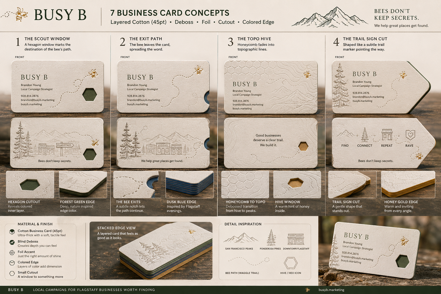
Click to open full-size and zoom.
- 1
The Scout Window Forest green edge
A hexagon cutout marks the destination of the bee's path — a window to the colored layer inside.
- 2
The Exit Path Dusk blue edge
A subtle die-cut notch where the bee leaves the card — the path continues past the paper.
- 3
The Topo Hive Honey gold edge
Honeycomb fades into topo lines across the whole front; a warm honey window on the back.
- 4
The Trail Sign Cut Honey gold edge
The whole card shaped as a trail marker; back walks Find → Connect → Repeat → Rave.
What your feedback settles
- 1 · The front. Which concept would you hand across your own counter without flinching? Rank your top three, any board.
- 2 · The deboss. Flight path, honeycomb-to-topo, or the full landscape? (Honeycomb lives only here, in the hand — never on the site.)
- 3 · The back line.“Bees don't keep secrets.” vs “We help great places get found.” vs “Good places deserve a clear trail.” — which one starts the right conversation?
- 4 · The extras. Edge color (forest / honey / dusk / cedar)? Hex cutout or solid? QR to the Scout Report — useful or clutter?
Note before you fall in love: the name, number, and email on these mockups are placeholders (“Brandon Young,” 928.814.2676, busyb.marketing addresses) — the real details go on whatever wins. Concepts are what's under review, and final print results vary from renders.
Companion reading: the True Blends concepts (the Pinecone Bee Mark on board one is a cousin of our Skep Pinecone) and the Homegrown brand page these cards would live inside.